- General
-
 Ideas
Ideas

Make disabled caches much more clear on the map (instead of grey make them red for example)
Answer

i kinda like gray ;-)
isn't it common to gray things out that are disabled?
Yes but too often i am at a cache after a while of seqrching. To find out it is disablrd.... Enabled and disabled colors are too close for me
I am very sorry.... Events are red, traditionals are green, multi is orange and a whole bunch is blue and finds are yellow. No offense but HOW are any of these close to gray? Making it red would make it look like an event.
Anyways, appreciate the feedback but gray is as far away from red/green/blue/orange/yellow as it can be. Enabled caches almost cover all rainbow colors so having gray with a saturation of 0 is as good as it can be.
Seeing the feedback so far this will be a NO from my side but thanks for the ideas.
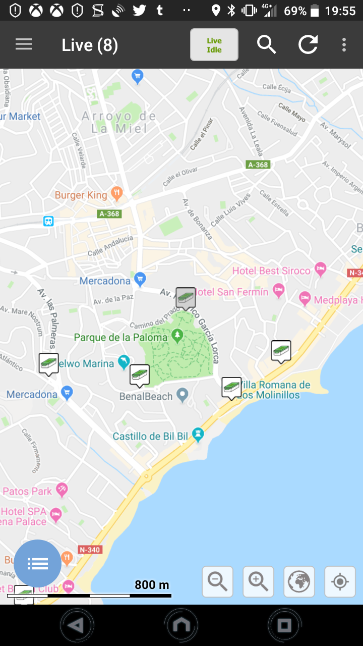
Here a screenshot with one disabled cache... Too. Easy to overlook. Sorry the. Wording was maybe not. Right.... But it is too easy to overlook a disabled cache this way...... Red cross. Through it..... Something to make the difference between an active an disabled one more clear
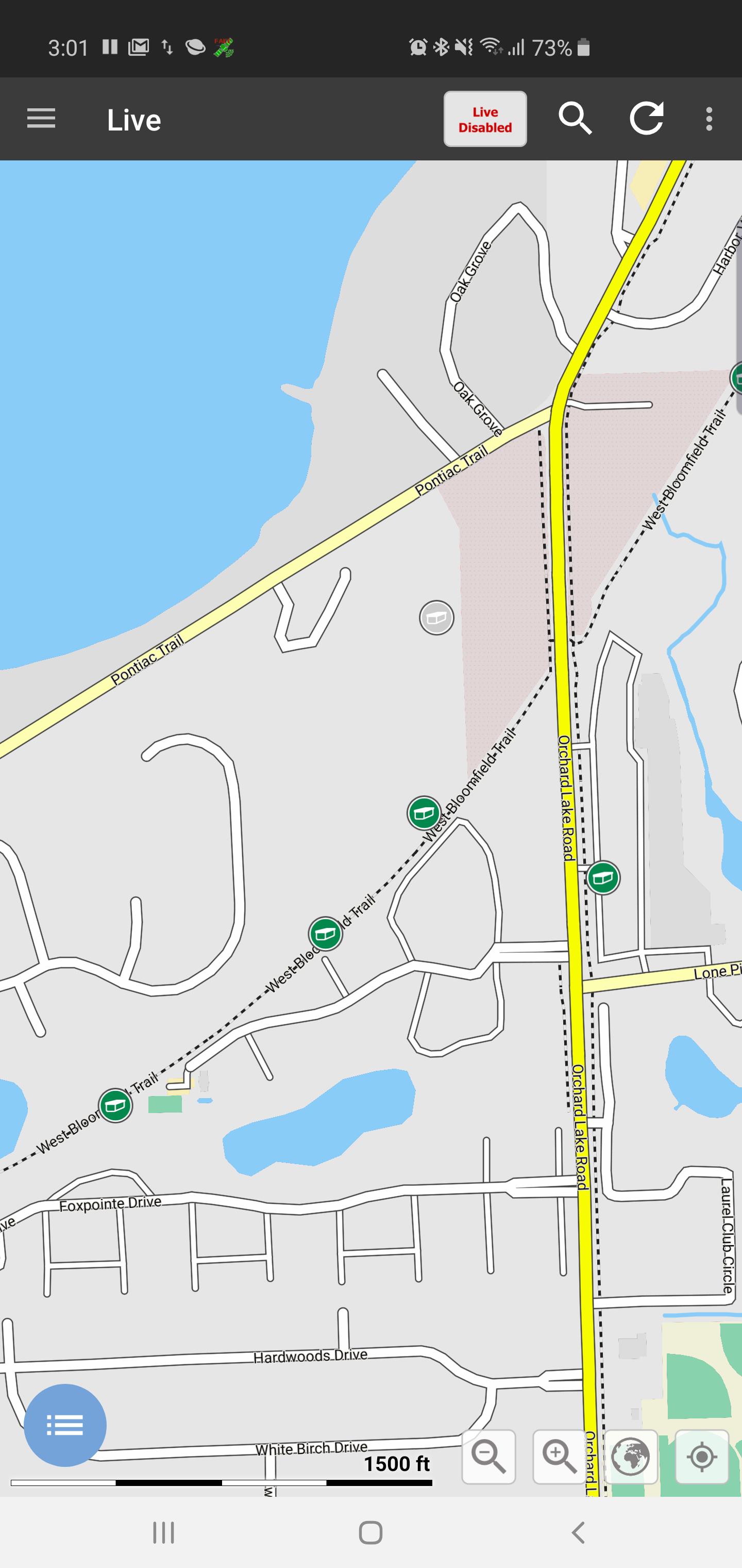
New version (current beta and beyond) will have icons as seen above. They are completely gray now. Sorry did not event think of the 'old' ones anymore. App with new icons is in beta and will be released soon...
I hope the above all gray will solve if for you. I agree, the slight gray can be overlooked but now it is not green anymore at all.
Works for you?
PS: thanks for the screenshot, helped me realize what you were looking at.

I'd also love to see a Red "no entry" icon for disable, as well as red archived, and Sad Smiley in Cyan blue as used in logs for DNFs, it's very prominent and visible on the Map.
This topic is closed. If you have a different wish/idea please create a new topic for it.
Customer support service by UserEcho

New version (current beta and beyond) will have icons as seen above. They are completely gray now. Sorry did not event think of the 'old' ones anymore. App with new icons is in beta and will be released soon...
I hope the above all gray will solve if for you. I agree, the slight gray can be overlooked but now it is not green anymore at all.
Works for you?
PS: thanks for the screenshot, helped me realize what you were looking at.